web design
Khiatani Jewels Website update
Khiatani Jewels is a luxury e-commerce platform that had been active for two years with only a handful of sales to reflect that. Our goal for this redesign was to polish the website for ease of access and to improve their SEO. By doing this, traffic to the website significantly increased and less carts were abandoned.Updated site pages
While editing this website I was met with unfinished sections, missing products & links that led nowhere. In my redesign I made sure to add the complete catalogue of available products, add a quick view option so users do not lose their place, & align all the sections for a cohesive look.
Celestial Treasures
Website Update
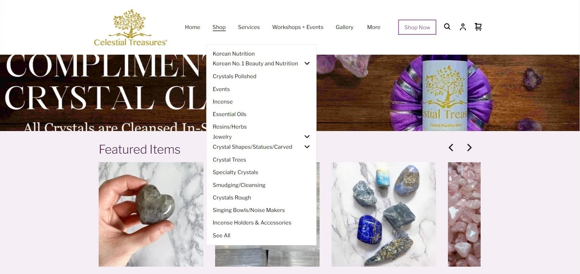
In this case study, I explore the redesign of Celestial Treasures' website, a local metaphysical shop. The primary objective was to enhance user experience, driving both traffic and sales. While modernizing the site's design, I ensured that the existing brand guidelines, including the color palette and logo, were seamlessly integrated to maintain brand consistency.For the new iteration I decided to clean up the menu bar, leaving only the important pages for ease of access. Opted for a longform layout so the user can scroll leisurely and be captivated by the new high quality images of featured items and events.
Original Home Page (Left)
The initial home page was a major pain point. It was composed of oddly sized images, lacked a cohesive flow & introduced the user to a confusing/cluttered interface. After going over their analytics, many shoppers abandoned the website here.
BEFORE
After
Mobile Site;
Per request, I created their mobile site to
match the secondary colors of their palette.
Redesigned Home Page (right)
For the new Shop All page (above) I hid all sold out items that would not be replenished & added images to those in stock. By adding a banner the user is reminded of what page they have navigated to. To navigate to this page the user will hover over the Shop button on the navigation banner & instead of having all the sections drop down, a new page will gently be introduced (below) with less options for the user to easily choose from.
garden center
My Role
Visual DesignerUX/UI DesignerThe redesign of a local garden center’s app to reflect the company’s newly renovated location. Garden Center wanted a modern revamp to encompass their locations new earthy atmosphere.
Garden Center started out as a brick & mortar location that quickly flourished. Many of their clients would call ahead for pick up or delivery orders and that is how the idea to create a mobile app came to be. They wanted their clients to have a seamless user flow with the purpose of placing orders at the forefront.
To celebrate their one year anniversary, Garden Center rebranded to showcase the company’s core values. They want to make modern luxury accessible to clients of all backgrounds, and they wanted this to be showcased in their app update.
The visual design of the app refresh focused on creating a clutter free interface. I incorporated a fresh new color palette inspired by their location so their clients have a sense of familiarity while keeping in mind the new luxurious approach.
Modern Luxury
To reflect the high-end revamp that Garden Center was working toward, the typeface moved from a unicode font to a geometric sans serif font. The initial color palette was inspired by florals and drew from bright spring tones & gradients. Our new color palette was influenced by their best selling plants, using differing shades of greens, tied together by a soothing beige.
Results
As a result of clients being able to complete the checkout user flow in 5 minutes, from around 15 minutes, mobile sales have increased by 15%. The accurate in stock inventory photos have driven traffic to their physical location by 20%.
Spa Booking
A clean tailored booking experience for all your spa needs with ease.
My Role
UX/UI DesignerVisual DesignerGoal
For this user flow, I carefully crafted an experience that would easily direct the user to book a service. This saves the user time, effort, and minimizes the steps needed to take to reach their end goal.
Another way to highlight the significance of the booking process is by using visual hierarchy. In the home screen, after the header, is a booking carousel that makes it easy for the user to browse find their desired service without having to fully explore the app.
Results
A clean and simple user flow ensures that the user can navigate through the app seamlessly.
By simplifying the booking user flow it reduces the abandonment rate. If most users are completing the process, the business will see an increase in conversion of sales.


